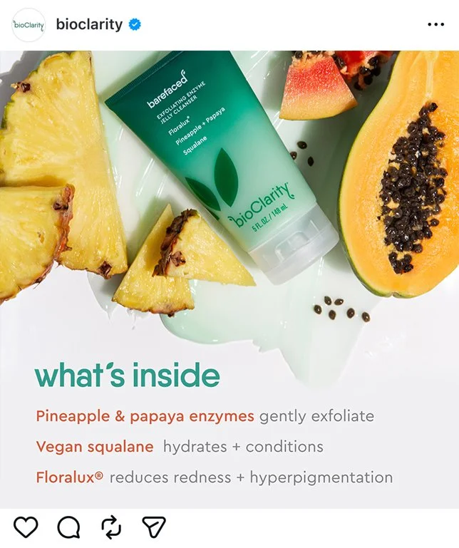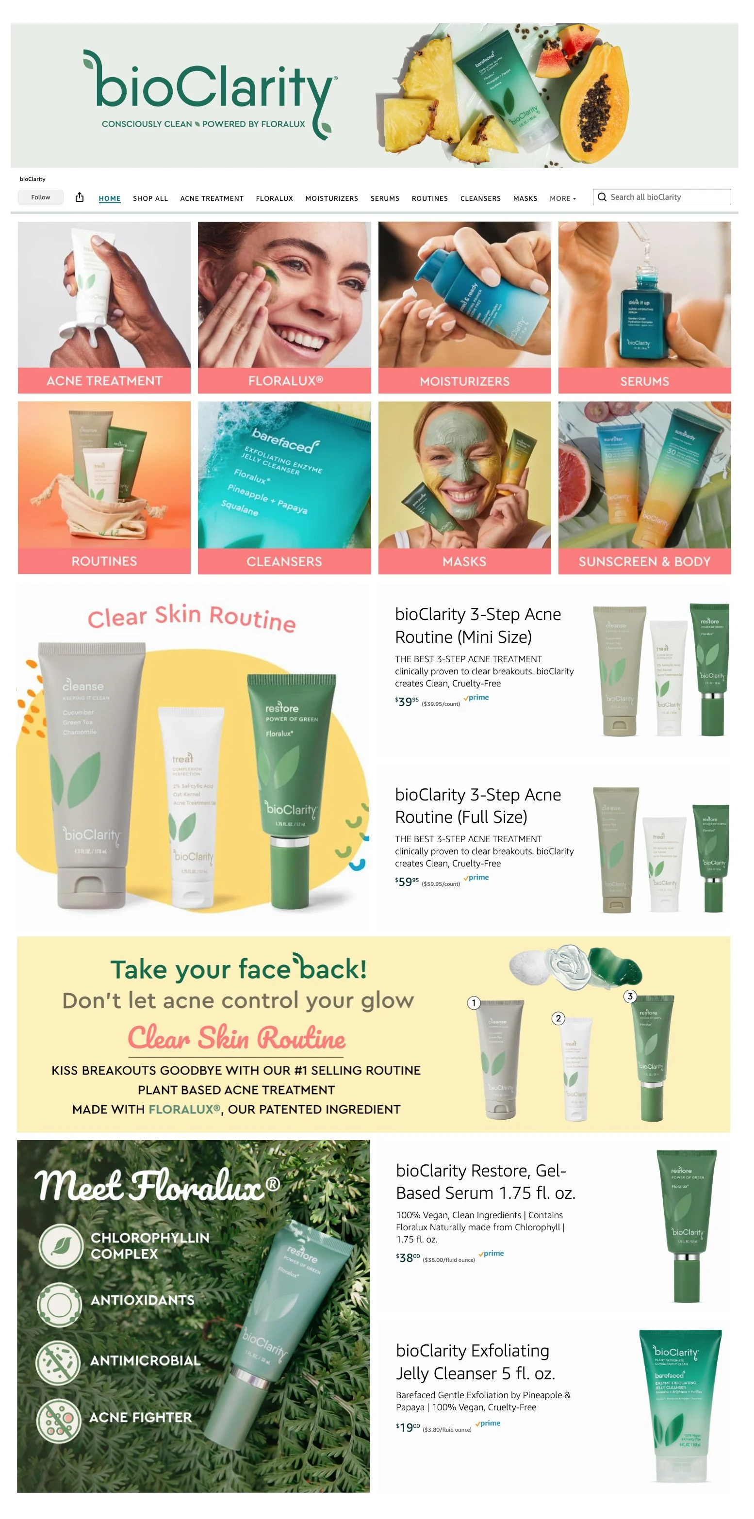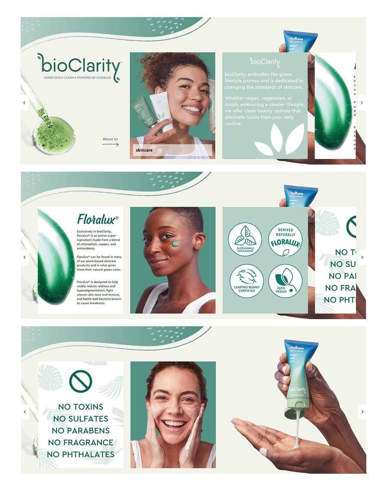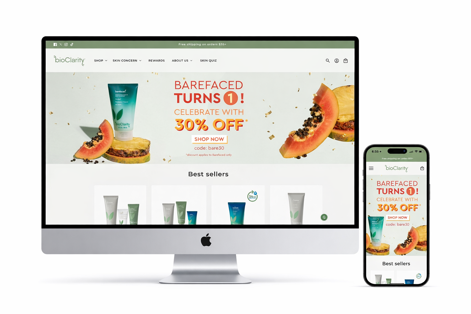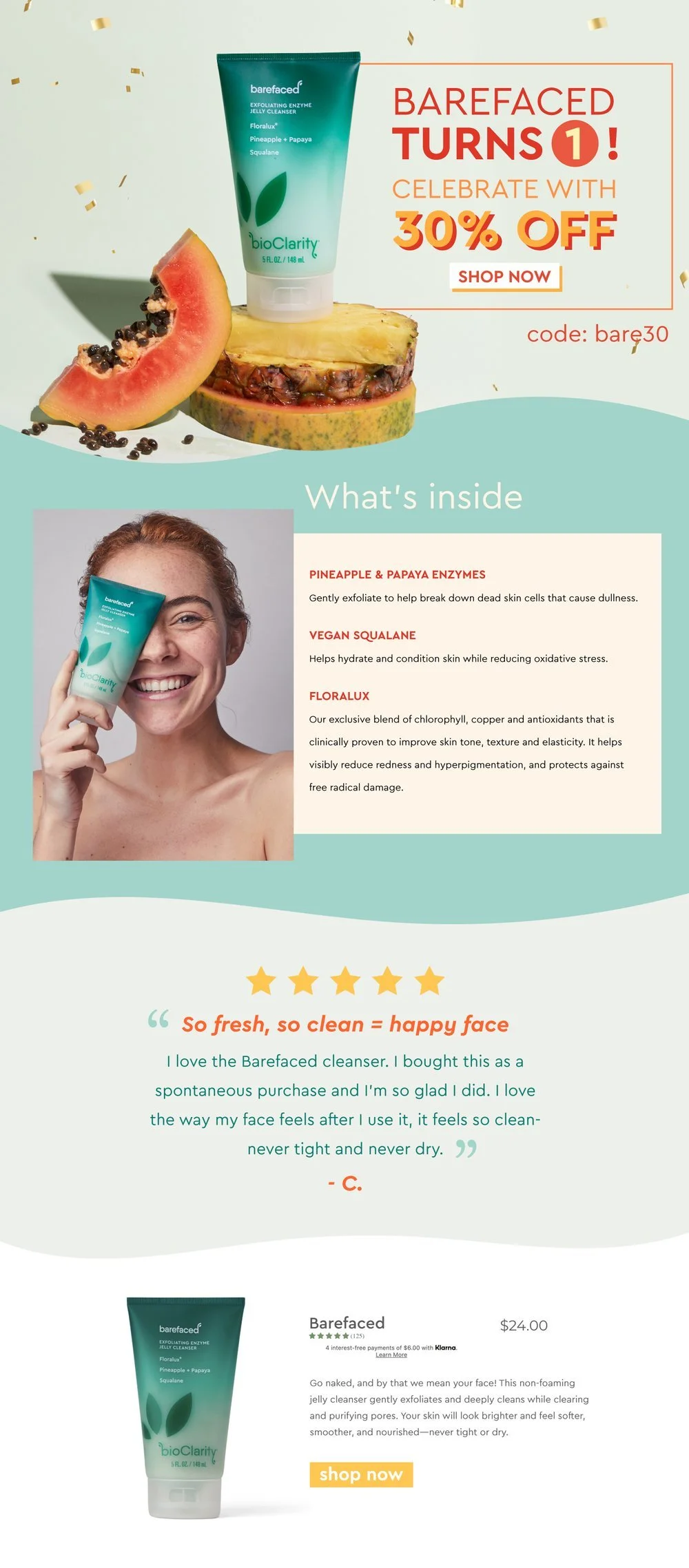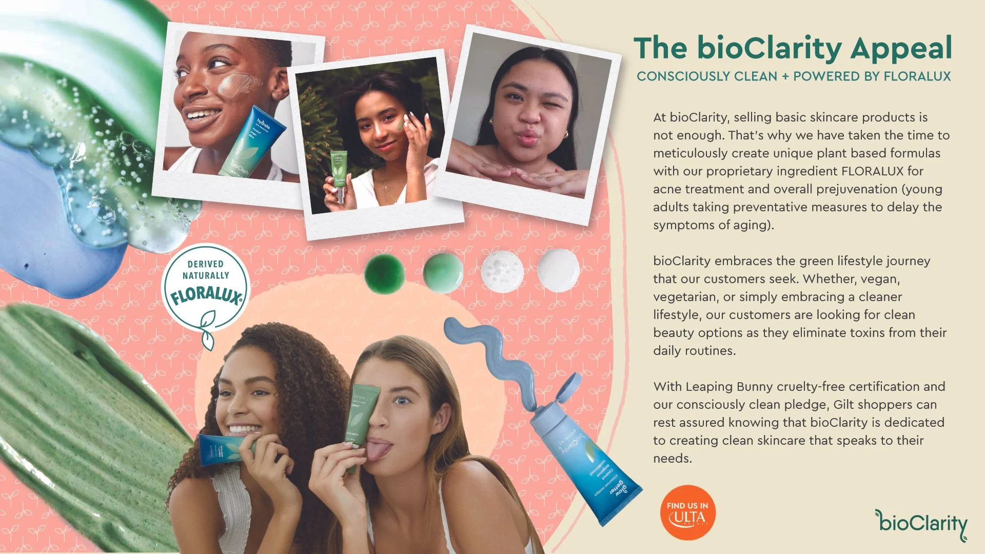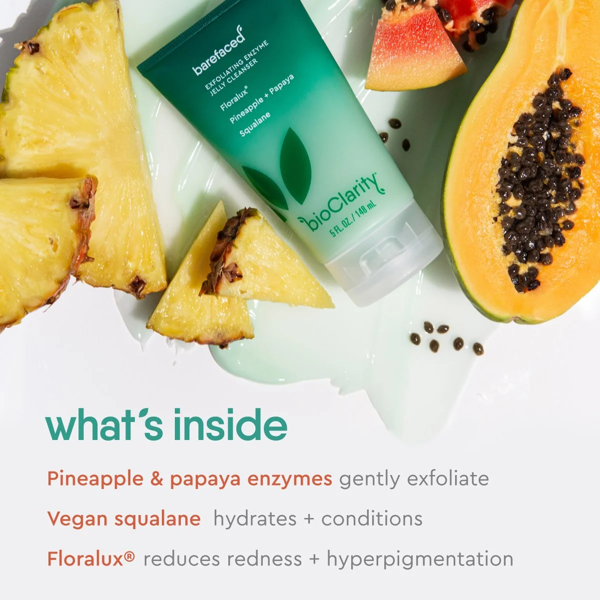
bioClarity
At bioClarity, I collaborated closely with the brand manager to create email, website, packaging, and print designs. One of the biggest challenges I faced was rebranding bioClarity to appeal to Gen Z consumers. bioClarity’s old branding seemed to cater to millennial, and had a very minimalist look. Because the generation is made up of younger adults and teenagers, I faced the challenge of transforming bioClarity into something lively and fresh. By researching trending colors, the brand manager and I settled on tropical inspired colors of coral, warm tones, and palm leaf green.